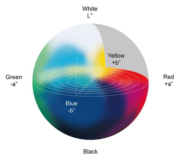
As stated earlier, when we have a set of XYZ values with the same numbers, we could say these colours look the same. But there are occasions when the XYZ values are not the same, but they still look very similar. For example, when we see a bright light in a bright room versus a dimmer light in a dim room, the measured XYZ values are not the same (due to different light intensities, but we still perceive the same colour of light. This is due to the adaptation of our visual system. Another scenario is to compare the colours from different media. For example, one from the monitor and one from the printed paper. Hence, we need another metric to quantify this adaptation phenomenon. L*a*b* colour space (shown in Figure 5) was then proposed and built for this ‘normalisation’ purpose. It defines the brightest level of light in a scene or a media (e.g. paper) as 100 and normalises all other colours in the scene or media according to the brightest light. As a result, now we can compare light with different intensities or colours from different media.